Nº 0421 · Graphic standards manual
NYC Subway Graphics Standards Manual
A rulebook of 1970 that set one visual standard for New York subway signs.
Why it matters
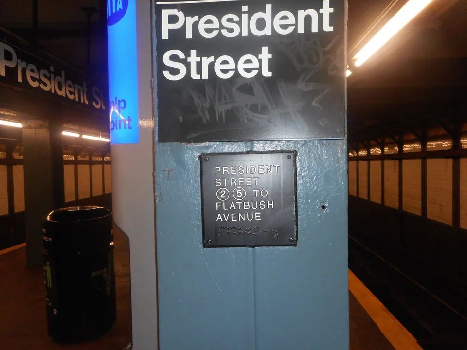
The manual turned a transit system’s signs into a written standard that other people could apply without the designers present. The design lives in the rules, not in any single sign.
Massimo Vignelli and Bob Noorda of Unimark produced the manual in 1970. It sets the rules for the typeface and sign formats of the New York subway, using a plain sans serif that the manual calls Standard. A copy found in the basement of Pentagram’s offices led Jesse Reed and Hamish Smyth to publish a facsimile in 2014.
2 min read
The full story
A system without a system
In 1966 the New York City Transit Authority hired Unimark International, the firm Massimo Vignelli had founded, to advise on signage and map conventions; a MoMA associate curator had recommended it. Vignelli and Bob Noorda were asked for a report within four months. In 1967 Mayor Lindsay’s Task Force on Urban Design had called the subway “the most squalid public environment of the United States,” and signage was one of its many problems. Unimark’s recommendations were only partly followed. The Authority’s in-house Bergen Street shop made the signs without the designers’ instruction or inspection, partly for reasons of cost and partly to avoid antagonising union workers after the twelve-day transit strike of January 1966. After public and professional criticism it rehired Unimark in 1968. The manual that came out in 1970 reflected four years of work.
In this story
- A system without a system
- Panels, stripes and a typeface
- Loosely followed
- A copy in the basement

The story continues in the app
- Published
- 1970, by Unimark
- Designers
- Massimo Vignelli and Bob Noorda
- Typeface
- A plain sans serif named Standard in the manual
- Reissue
- 2014, 364 pages, 176 four-colour plates
Connections
Go further
- An Illuminating History of Modern Graphic Design, HyperallergicOn the manual’s rediscovery and reissue.
- Get a reissue of the famous 1970 NYC subway graphics standard manual via Kickstarter, Marta Elliott, Untapped Cities (2014)The reissue campaign and what the book contains.
Sources
- An Illuminating History of Modern Graphic Design, Hyperallergic
- Get a reissue of the famous 1970 NYC subway graphics standard manual via Kickstarter, Untapped Cities
- 10 fun facts about the NYC Transit Authority Graphics Standard, Untapped New York
- ‘Helvetica and the New York City Subway System’ Is a Splendid Visual History of Subway Signage, PopMatters
- The font now arriving at platform 1 (review of Helvetica and the New York Subway System), Eye magazine
- A Tale of Type and Transportation, Goodreads author blog (quoting Michael Bierut)
- About Standards Manual, Standards Manual