Nº 0102 · Typeface
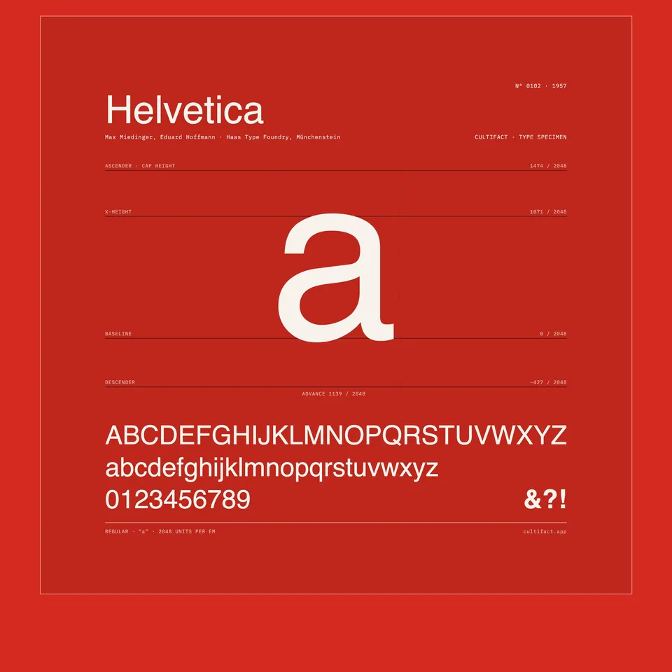
Helvetica
The typeface that tried to say nothing, and ended up everywhere.
Why it matters
A neutral grotesk, drawn so evenly that it could carry any message without adding one of its own. Neutrality became the message.
Hoffmann wanted a modern rival to Akzidenz-Grotesk; Miedinger drew it with tight spacing, a large x-height and terminals cut horizontally. Released as Neue Haas Grotesk, it was renamed for Stempel's German market in 1960 after Helvetia, the Latin name for Switzerland. Within fifteen years it was the house face of airlines, tax forms and subway maps.
3 min read
The full story
Losing sales to Berthold
By the mid 1950s Swiss designers had settled on a favourite sans serif, and it was not Swiss. Akzidenz-Grotesk, from the Berthold foundry, was being imported in quantities that far exceeded what the Haas Type Foundry in Münchenstein, near Basel, sold of its own type. Eduard Hoffmann, who ran Haas, had thought about a new grotesque around 1950 and put the idea aside. In 1956 he went ahead.
In this story
- Losing sales to Berthold
- Semi-bold came first
- A name for export
- Copied, redrawn, collected

The story continues in the app
- Classification
- Neo-grotesque sans
- Original medium
- Foundry metal type
- Rights holder
- Monotype
- In collection
- MoMA, since 2007
Connections
Nearby in the archive
In collections
Go further
- Helvetica Forever: Story of a Typeface, Victor Malsy and Lars Müller (eds.), Lars Müller Publishers (2009)The fullest account of the typeface’s first fifty years, built on the Haas foundry archive and the letters between Miedinger and Hoffmann.
- Helvetica, Gary Hustwit (2007)An 80-minute documentary in which designers argue for and against the typeface while the camera finds it on city streets.
- Helvetica and the New York City Subway System, Paul Shaw (2009)A close study of the subway’s signage and of when Helvetica did and did not appear on it.
- Neue Haas Grotesk, Christian SchwartzThe designer of the 2010 revival explains what the metal original had that later versions lost.
- New Installation in Architecture & Design Galleries Celebrates MoMA’s Acquisition of Helvetica Font, The Museum of Modern Art (2007)The museum’s press release for 50 Years of Helvetica, listing what was shown beside the original lead type.
Sources
- Monotype, Helvetica history, Monotype
- Museum für Gestaltung Zürich, poster collection, Museum für Gestaltung Zürich