Cultifact / Collections / Letters
Letters
A Roman inscription and 13 typefaces, from AD 113 to 1976.
Each of these fixed a way of drawing letters: the capitals of Trajan’s Column in AD 113, Garamont’s Paris roman, Caslon’s roman of about 1725, Baskerville’s sharper contrast, Bodoni’s hairlines, Berthold’s Akzidenz-Grotesk of 1898, Johnston’s sans serif for the Underground, Renner’s circles and straight lines, Gill’s sans serif on Roman proportions, the face first set in The Times in 1932, Miedinger’s even sans serif and Frutiger’s Univers, drawn as a family of 21 variations, both of 1957, Zapf’s flared Optima and Frutiger’s lettering for an airport’s signs, released as a text face in 1976. Read in order, they trace how printed letters changed over nearly nineteen centuries.
AD 113 → 1976 · 13 works
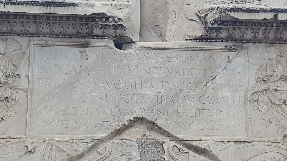 Trajan's Column inscriptionApollodorus of Damascus (attributed) · 113 AD
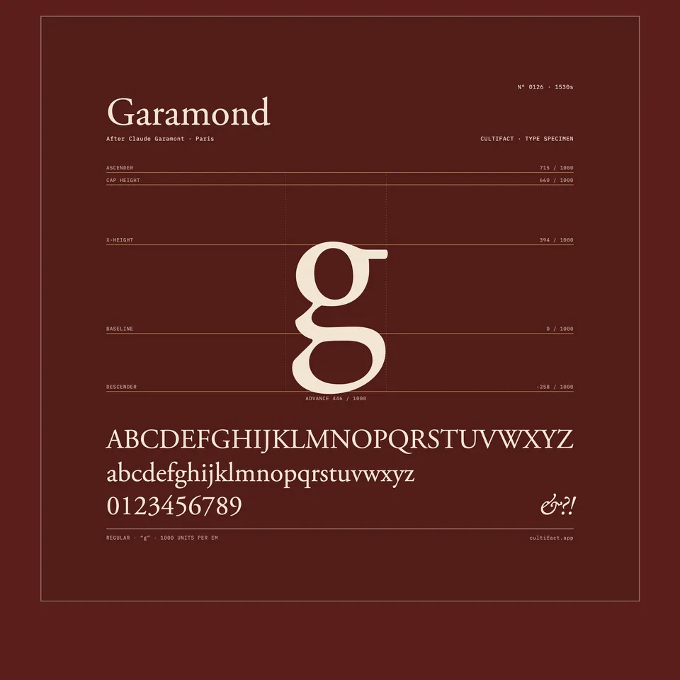 GaramondClaude Garamond · 1530s
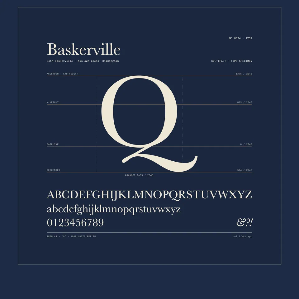 BaskervilleJohn Baskerville · 1757
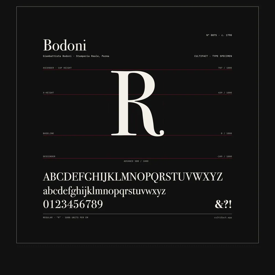 BodoniGiambattista Bodoni · c. 1790
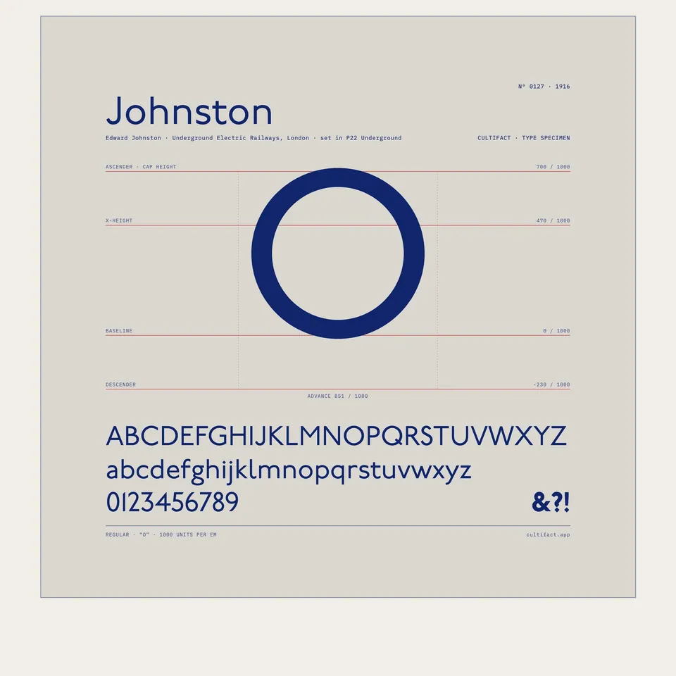 JohnstonEdward Johnston · 1916
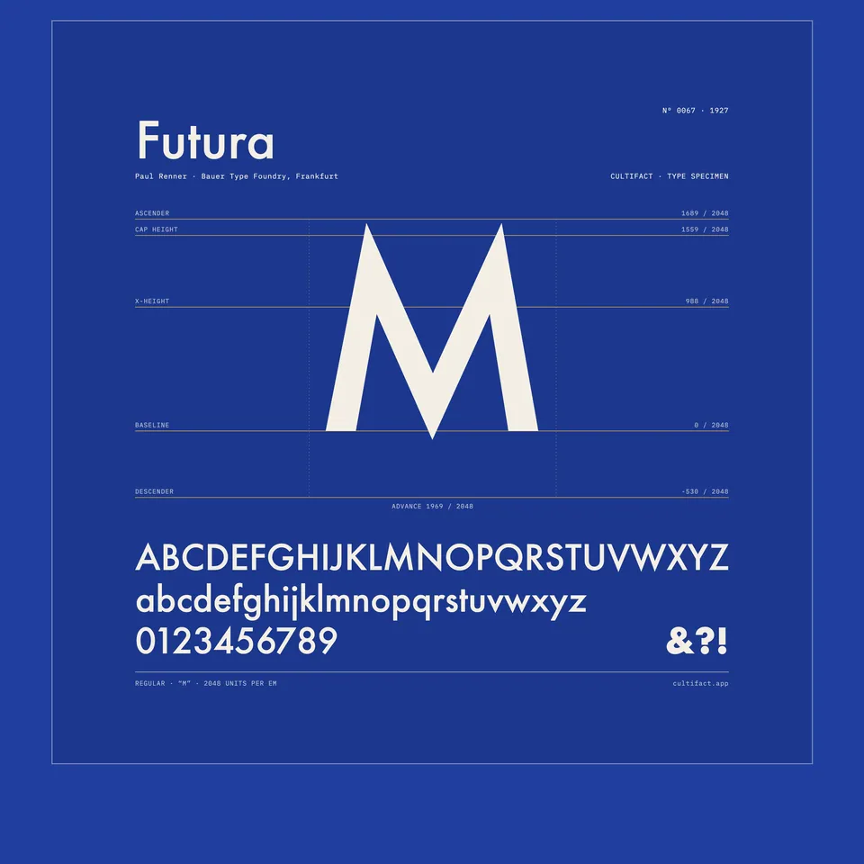 FuturaPaul Renner · 1927
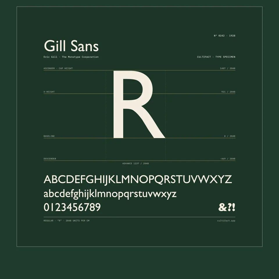 Gill SansEric Gill · 1928
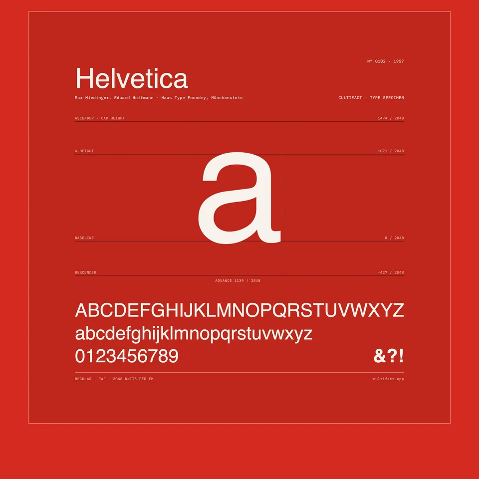 HelveticaMax Miedinger with Eduard Hoffmann · 1957
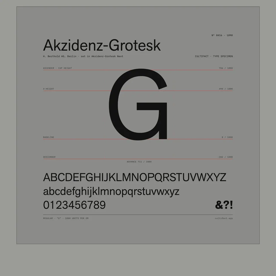 Akzidenz-GroteskH. Berthold AG · 1898
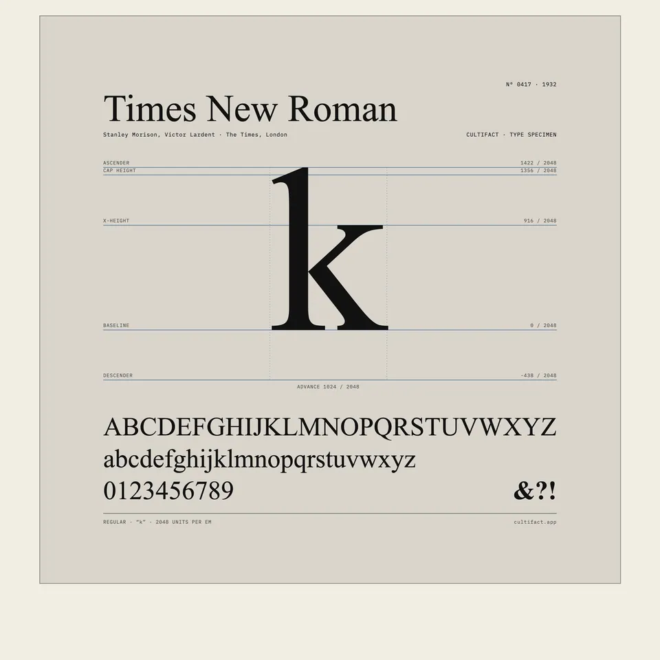 Times New RomanStanley Morison with Victor Lardent · 1932
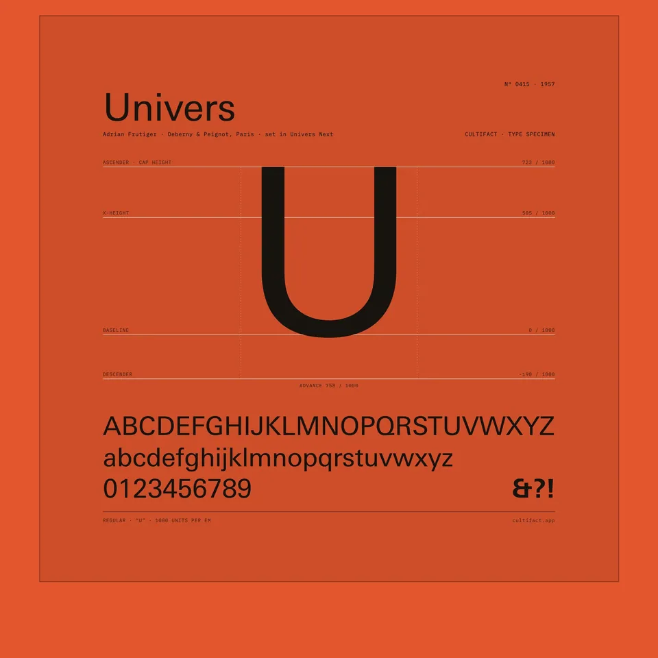 UniversAdrian Frutiger · 1957
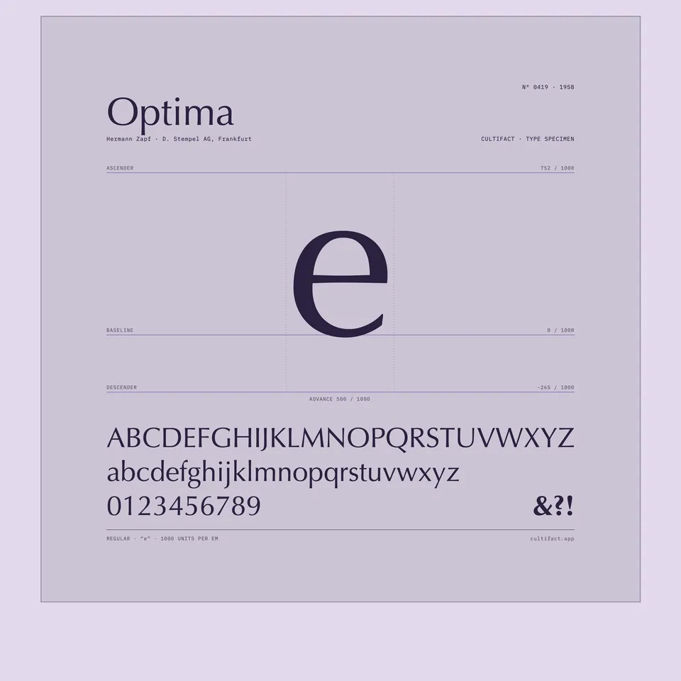 OptimaHermann Zapf · 1958
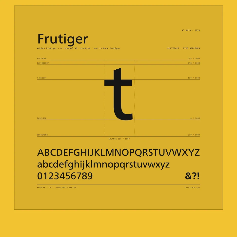 FrutigerAdrian Frutiger · 1976
Read it in Cultifact
The app has the full story, details you can zoom into, and how this work connects to others. Free to browse, in ten languages.

Free to browse on iPhone. No account needed, no ads.