Nº 0418 · Typeface
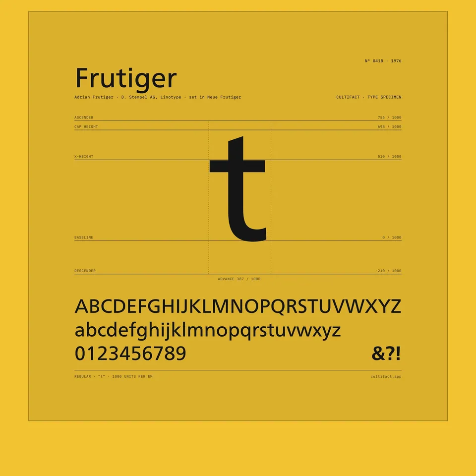
Frutiger
A signage face made for an airport and released for print in 1976.
Why it matters
Frutiger began as lettering for the signs of Charles de Gaulle airport and ended as a face for printing. It grew out of Concorde, an earlier face by the same designer that was withdrawn when its publisher was bought.
Adrian Frutiger drew Concorde for Sofratype, which released it in 1968. When Linotype bought Sofratype, Concorde was withdrawn and the rights returned to Frutiger. The design reappeared on the signs of Charles de Gaulle airport in 1970–1971. Stempel released it in 1976, and Linotype re-released it as Frutiger the same year.
2 min read
The full story
From Univers to a signage problem
Adrian Frutiger was born in Switzerland in 1928, trained there and settled in Paris, where he worked for the foundry Deberny & Peignot. In 1954 he drew Univers, a sans serif family whose weights could be specified by number. In 1962 he opened a studio at the Villa Moderne in Arcueil with André Gürtler and Bruno Pfäffli.
In this story
- From Univers to a signage problem
- Concorde, withdrawn and returned
- A text face in 1976

The story continues in the app
- Concorde
- Released 1968 by Sofratype; withdrawn after Linotype bought Sofratype
- Airport signage
- Charles de Gaulle airport, 1970–1971
- Airport face completed
- 1975
- Release
- 1976, by Stempel and Linotype
Connections
Nearby in the archive
In collections
Go further
- Type Design Information Page: Frutiger, Luc DevroyeA dated outline of the family’s origin and releases.
Sources
- Type Design Information Page: Frutiger, Luc Devroye
- Designer of the invisible (Adrian Frutiger and the Roissy typeface), Parisian Fields
- Frutiger (typeface), Wikipedia
- Mr Univers, Erik Spiekermann