Nº 0067 · Typeface
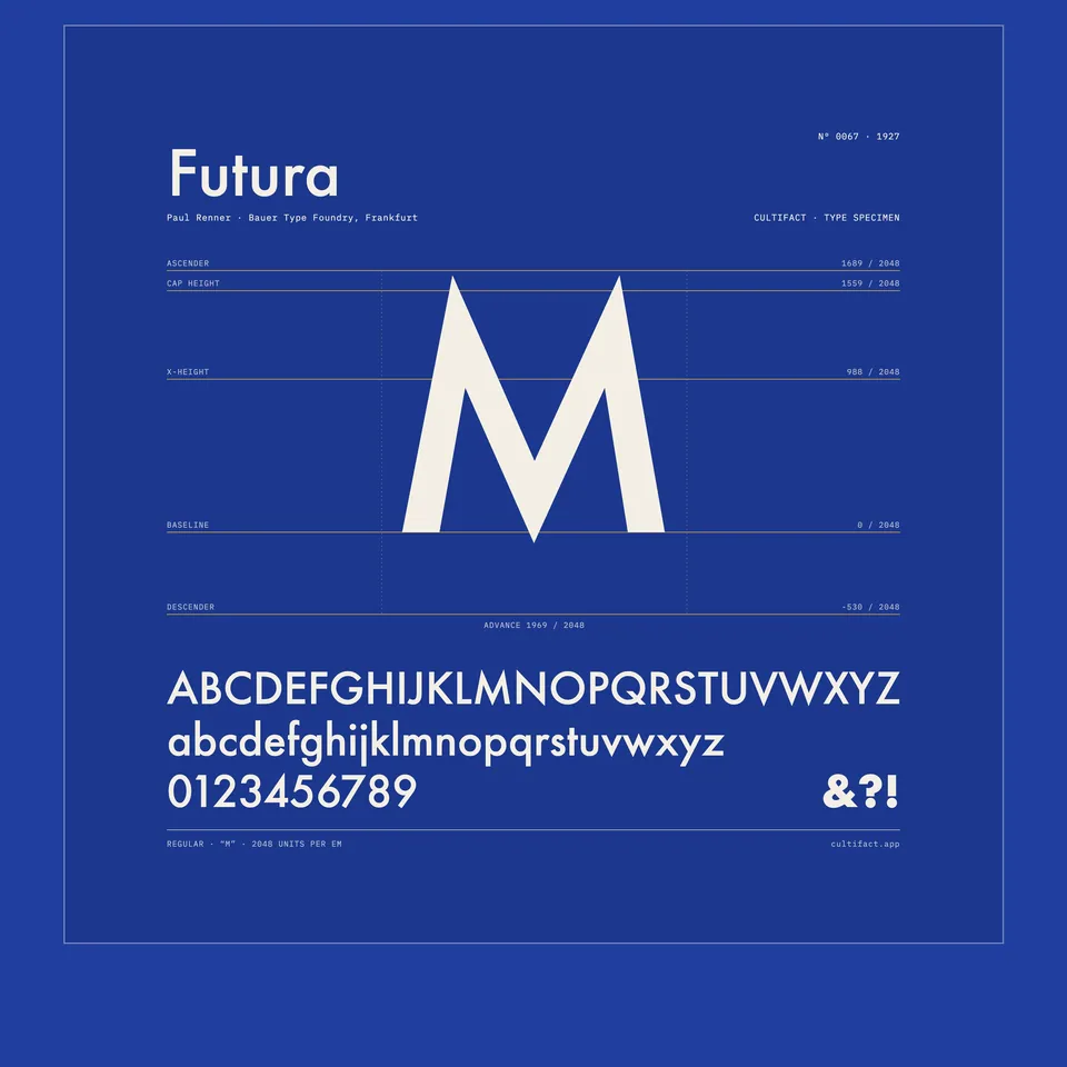
Futura
Letters built from circles and straight lines.
Why it matters
Futura was not the first geometric sans serif, but it became the one that spread: letters built from circles and straight strokes, with quiet optical corrections. Bauer sold it as the typeface of today and tomorrow.
Paul Renner drew it from 1924, and the Bauer Type Foundry in Frankfurt released it in 1927. His first drawings had a square m and n and a stick-and-ball r, which were dropped for more conventional shapes. The family grew from 1928, with a light weight and then Futura Black in 1929. The specimen shown is Futura Medium, printed from metal type.
What to notice
- The aThe lowercase a is a single storey, almost a full circle.
- AscendersThe ascenders of d and b rise above the capital H.
- The oThe o looks like a circle; it is slightly oval.
3 min read
The full story
A book designer's alphabet
Paul Renner was in his mid-forties when he began sketching the letters in 1924. He was a book designer, and two years earlier he had published Typografie als Kunst, a book on typography as an art. He wanted a printing type that matched the mood of its time, one he described as exact, precise and impersonal. It should not, he added, imitate handwriting of any kind.
In this story
- A book designer's alphabet
- Geometry, then correction
- Copied on both sides
- After metal

The story continues in the app
- Foundry
- Bauersche Giesserei, Frankfurt
- Released
- 1927
- Early styles
- Light 1928 · Black 1929
- Marketed as
- The typeface of today and tomorrow
- Status
- Real · sold in digital versions
Connections
- Paul Renner
- Bauersche Giesserei
- Era of the World Wars
- Type design
- Frankfurt am Main
Nearby in the archive
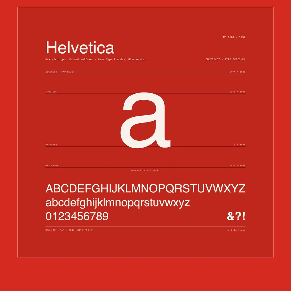 HelveticaMiedinger · 1957 · the next sans serif to spread
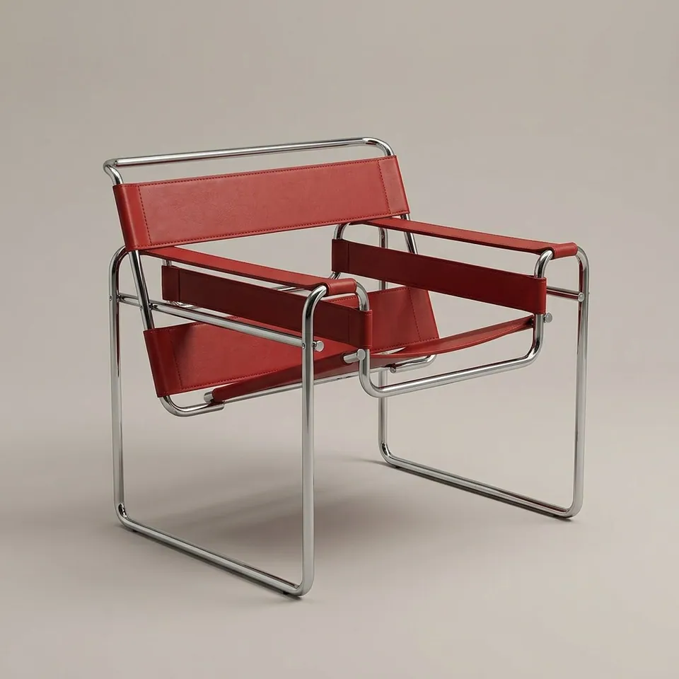 Wassily ChairBreuer · 1925 · the same years, the same geometry
In collections
Go further
- Paul Renner: The Art of Typography, Christopher Burke (1998)The standard biography, with a full account of how Futura was drawn, revised and manufactured at Bauer.
- Never Use Futura, Douglas Thomas (2017)A history of how the typeface was used, copied and argued over across the twentieth century.
- Futura: The Typeface, Petra Eisele, Annette Ludwig and Isabel Naegele (2017)An illustrated survey, first published in German with the Gutenberg-Museum in Mainz, that follows the typeface from Frankfurt outwards.
- Will the real Futura please stand up?, Sara Rosinsky, Monotype (2020)A timeline of the family, its American imitators and what phototype and digital setting did to it.
- Futura at 90, Creative Review (2017)The editors of Futura: The Typeface on Renner's Roman sources and the people at Bauer who backed the design.
Sources
- Will the real Futura please stand up, Monotype
- Paul Renner, type designer list, Klingspor Museum
- Bauhaus typefaces, part two, Letterform Archive
- Futura (typeface), Wikipedia