Nº 0415 · Typeface
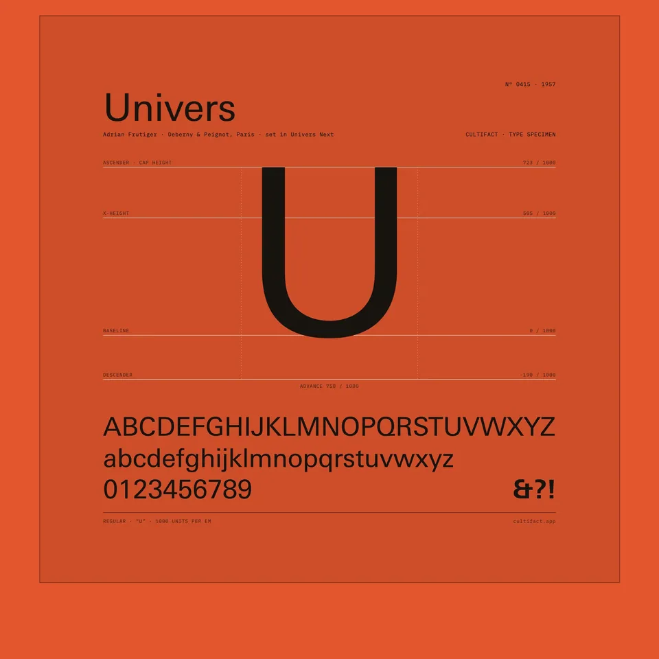
Univers
A sans serif drawn as a family, released in 21 variations in 1957.
Why it matters
Univers was planned as a set of related styles rather than one face with additions. It reached the market on phototypesetting equipment, not as metal type.
Adrian Frutiger drew Univers at the foundry Deberny & Peignot. His first sketches date to 1950. The typeface was released in 1957 for phototypesetting and launched with 21 variations.
2 min read
The full story
A sketch from 1950
Adrian Frutiger was born in 1928 in Unterseen, in the canton of Bern. He trained as a printer’s apprentice in Interlaken from 1944 to 1948, studied in Zurich, and in 1952 joined Deberny & Peignot in Paris. The ANRT Nancy paper on Univers dates his first sketches for a sans serif to 1950, during his studies, and notes that a draft from February of that year already shows many features that later appeared in Univers.
In this story
- A sketch from 1950
- Peignot’s gamble
- Numbers instead of names
- Across machines, and into use

The story continues in the app
- Designer
- Adrian Frutiger
- First release
- 1957, for phototypesetting
- Launch range
- 21 variations
- First sketches
- 1950
Connections
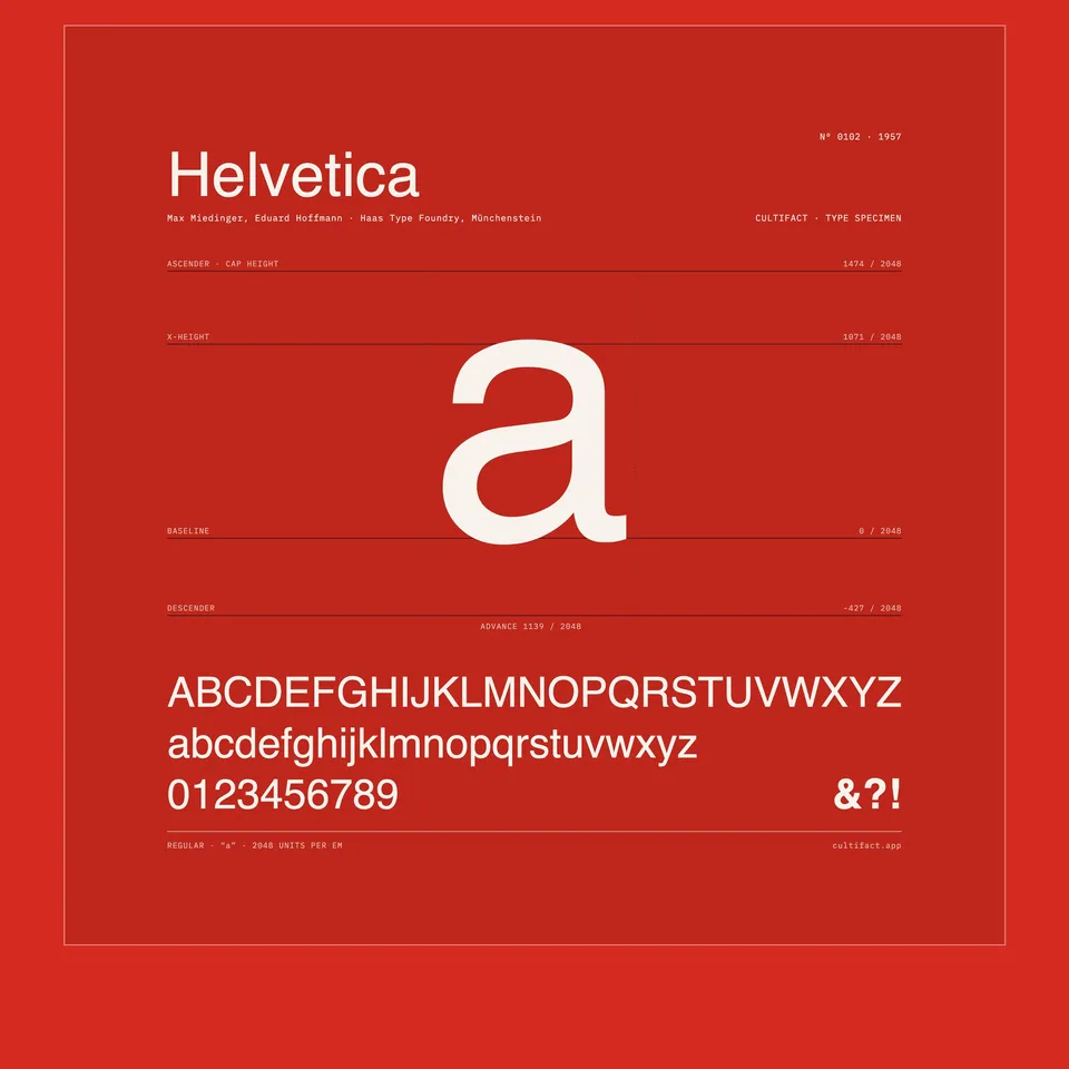
Nearby in the archive
In collections
Go further
- From Univers to Multivers, Anna-Lena Würth, Revue Composite no. 5 (2024)A paper on the family’s history and its later reworkings.
Sources
- From Univers to Multivers (Revue Composite no. 5), Anna-Lena Würth, ANRT Nancy
- Univers, Fonts In Use
- Swiss designer stamps his mark, swissinfo.ch
- Mr Univers, Erik Spiekermann