Nº 0075 · Typeface
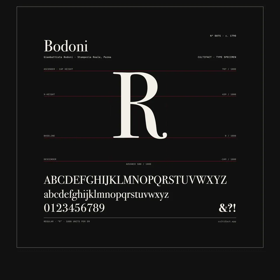
Bodoni
Hairline serifs against heavy upright stems.
Why it matters
Bodoni pushed the contrast between thick and thin strokes to an extreme, and his letters define the class now called Didone, or modern. His Manuale tipografico of 1818 is a working record of alphabets, ornaments and non-Latin scripts.
Giambattista Bodoni, born in Saluzzo in 1740, worked at the Propaganda Fide press in Rome before taking charge of the Duke of Parma’s press in 1768, where he stayed. His early types followed Fournier; later he drew on Baskerville’s contrast and moved to the flat, unbracketed serifs and vertical stress of his mature style. A first Manuale tipografico appeared in 1788, and the fuller edition, unfinished at his death in 1813, was published by his widow in 1818. His punches and matrices are kept at the Museo Bodoniano in Parma, which opened in 1963.
What to notice
- The serifsFlat hairline serifs meet thick vertical stems at a right angle.
- The GRound letters stand upright, the weight gathered in the sides of the curve.
- The imprintParma, presso la vedova, MDCCCXVIII: published by his widow in 1818.
3 min read
The full story
A detour to Parma
Bodoni was a printer’s son from Saluzzo in Piedmont. At eighteen he went to Rome and was taken on at the press of the Propaganda Fide, the Vatican office that printed for missions abroad and so kept type for languages most printers never handled. He learned something of oriental languages, and was soon cutting type for the press himself. After the death of its director he left, meaning to look for work in England.
In this story
- A detour to Parma
- Small steps between sizes
- A stop on the Grand Tour
- What the cabinets keep

The story continues in the app
- Class
- Didone, or modern serif
- Manuale tipografico
- 1788 · fuller edition 1818
- Press
- Stamperia Reale, Parma, from 1768
- In collection
- Museo Bodoniano, Parma (punches and matrices)
- Status
- Real · many revivals
Connections
Nearby in the archive
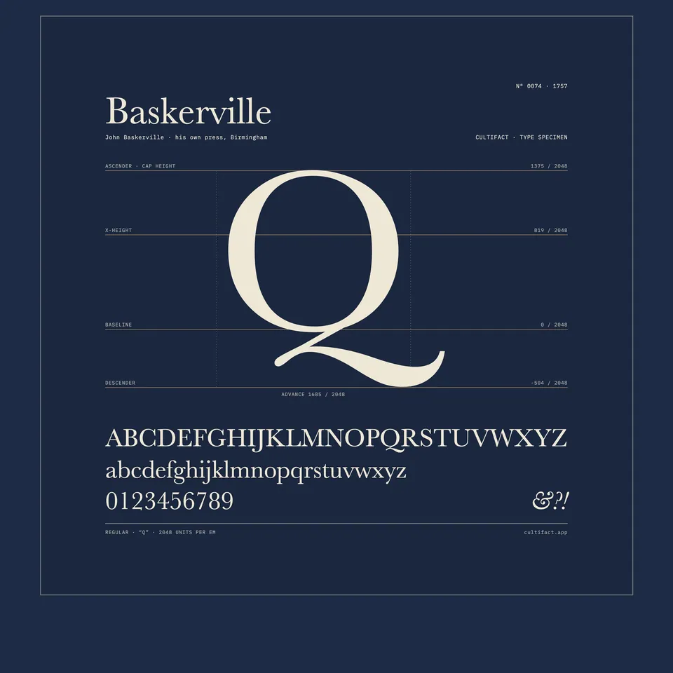 BaskervilleBaskerville · 1757 · the contrast Bodoni admired
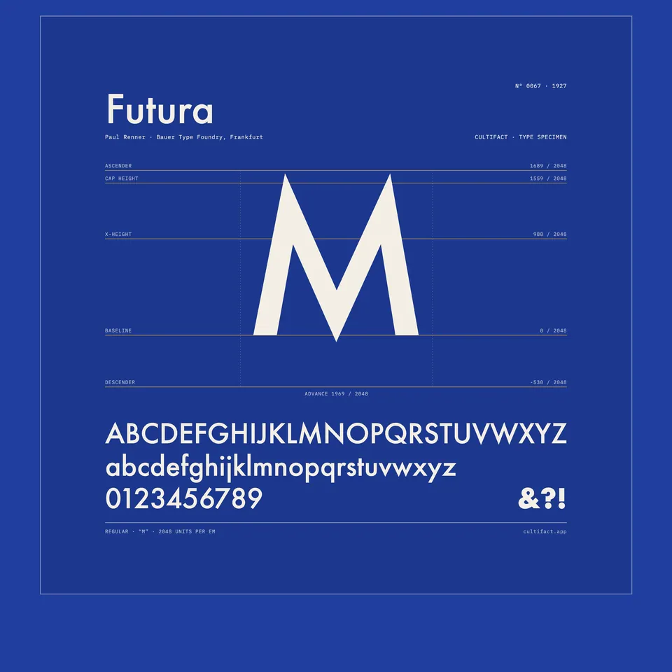 FuturaRenner · 1927 · geometric construction again, without serifs
In collections
Go further
- Giambattista Bodoni: His Life and His World, Valerie Lester (2015)The first full biography in English, illustrated with specimens, book pages and views of Parma.
- Bodoni: Manual of Typography, Stephan Füssel (ed.), Taschen (2010)A reprint of the 1818 Manuale tipografico with an introduction to Bodoni and his press.
- Manuale tipografico, 1818 (digitised copy), Internet ArchiveA scan of the first volume, which holds the widow’s address, Bodoni’s preface and the roman and italic types.
- The Bodoni Printing Manual, Palazzo della Pilotta, on Google Arts & CultureA short illustrated tour of the 1818 Manuale from the Parma complex that houses the Museo Bodoniano.
- The man behind the typeface, Robert Hanks, Fedrigoni Pulp (2022)A brief life of Bodoni that covers his press, his visitors and his critics.
Sources
- The man behind the typeface, Fedrigoni, Pulp
- Museo Bodoniano's celebration of Giambattista Bodoni's Manuale Tipografico, TypeRoom
- Wikipedia (English), Wikimedia Foundation
- Bodoni, Wikipedia