Nº 0242 · Typeface
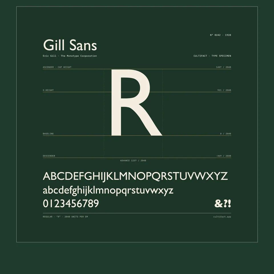
Gill Sans
Bristol shop-sign letters, redrawn for Monotype casting.
Why it matters
Gill Sans is a sans serif built on the proportions of classical Roman letters rather than on circles and straight lines, a different answer to the geometric German sans serifs of the late 1920s. It became a house type for the London and North Eastern Railway, Penguin Books and the BBC, and by the mid 1930s it had more weights than any competing typeface.
In 1926 Eric Gill painted the fascia of Douglas Cleverdon’s bookshop in Bristol, and in 1927 Stanley Morison of the Monotype Corporation saw the lettering and commissioned Gill to develop it. The Titling capitals were issued in 1928 and the roman and italic followed in 1929 and 1930, with bolder and lighter weights through the 1930s. Monotype’s drawing office redrew Gill’s letters to suit machine casting and sent proofs back to him for correction. The design follows Edward Johnston’s lettering for the London Underground, with a two-storey a, an eyeglass g and a capital R with a curved leg.
What to notice
- The two-storey aThe lowercase a keeps its upper bowl, a form taken from roman type rather than from a circle.
- The eyeglass gThe g has two closed bowls joined by a short link.
- Roman proportionsThe capitals vary in width: C and O are nearly round, M is broad, as in classical Roman inscriptions.
3 min read
The full story
A fascia in Bristol
Eric Gill was a sculptor and letter cutter who had once been a student of Edward Johnston, the calligrapher behind the sans serif lettering of the London Underground. In 1926 Gill's friend Douglas Cleverdon, a young Bristol bookseller and printer, asked him to paint the sign for his new shop. Gill lettered the fascia in plain sans serif capitals.
In this story
- A fascia in Bristol
- Redrawn at Salfords
- Posters, timetables, paperbacks
- Metal to Nova

The story continues in the app
- First release
- Gill Sans Titling, Monotype Series 231, 1928
- Roman and italic
- Series 262, 1929 to 1930
- Format
- Metal type for Monotype casting; later film and digital
- Used by
- London and North Eastern Railway · Penguin Books · BBC
- In collection
- Science Museum Group (pattern for Series 262, 1995-1107/3)
Connections
Nearby in the archive
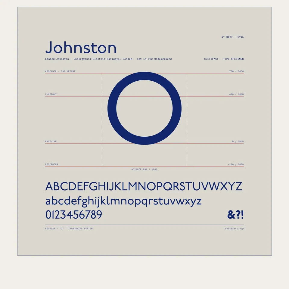 JohnstonJohnston · 1916 · the Underground lettering it follows
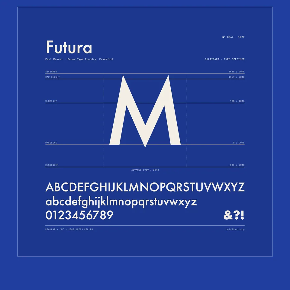 FuturaRenner · 1927 · the geometric sans it answered
In collections
Go further
- An Essay on Typography, Eric Gill (1931)Gill's own argument about lettering, printing and machine production, printed in 1931 at his private press at Pigotts.
- Eric Gill, Fiona MacCarthy (1989)The standard biography, covering his lettering and type work as well as the abuse it brought to light.
- Signature typeface, Eye magazine (2012)Test proofs from the Monotype archive showing Gill's painted and pencilled corrections to the type.
- Pattern for Gill Sans (Typeface Series number: 262), Science Museum GroupThe museum record for a 1929 Monotype pattern used in making the matrices for the roman.
- Gill Sans Nova, MonotypeThe maker's page for the 2015 expansion of the family, with notes on its history and its designer George Ryan.
Sources
- Pattern for Gill Sans (Typeface Series number: 262), 1995-1107/3, Science Museum Group
- Monotype Gill Sans Nova, Monotype
- Blog post on Gill Sans (Signature typeface), Eye Magazine
- Wikipedia (English), Wikimedia Foundation
- Gill Sans, Wikipedia