Nº 0127 · Typeface
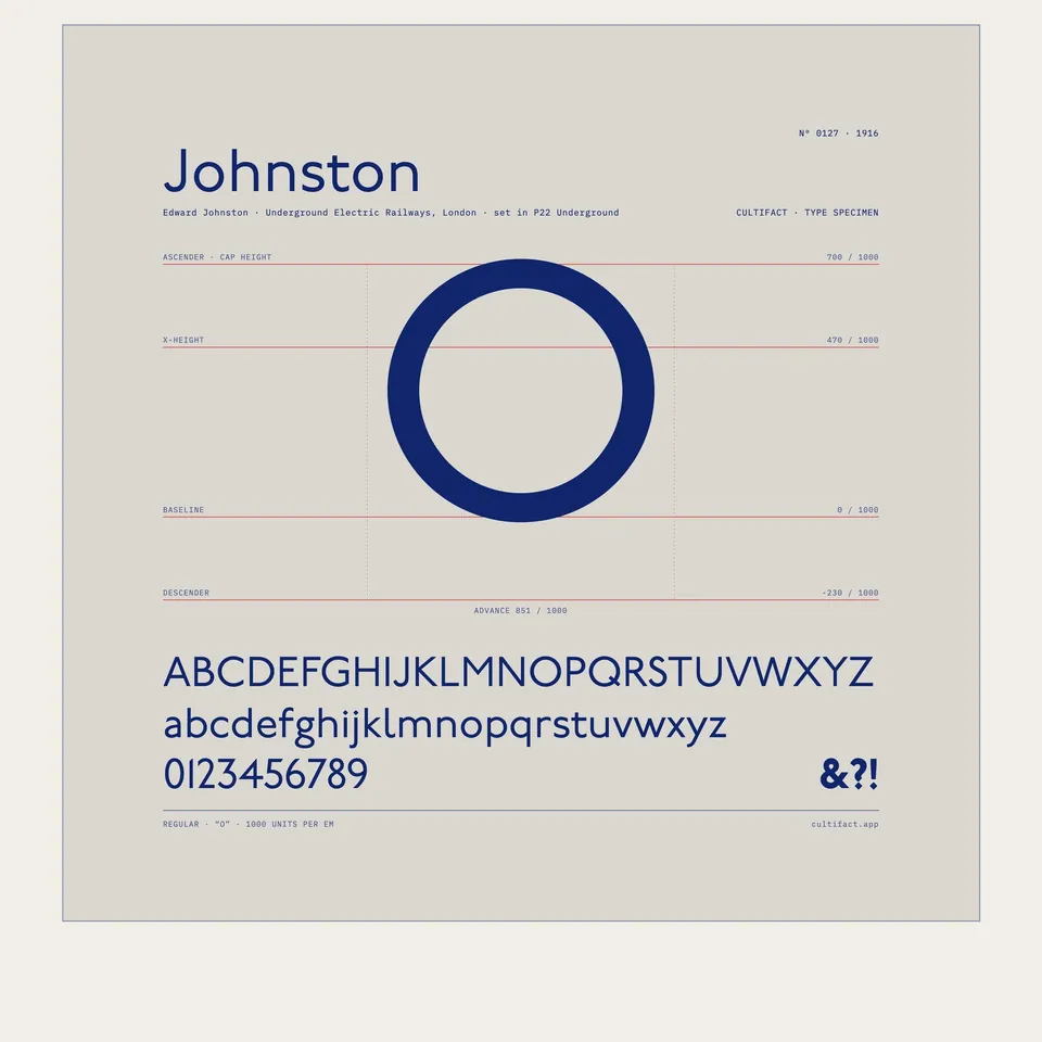
Johnston
A calligrapher’s alphabet for the London Underground.
Why it matters
Frank Pick asked for lettering with the plain strength of the best historic letters that still belonged to the twentieth century, and Johnston, a calligrapher, answered with a sans serif built on the proportions of Roman capitals. It has been the lettering of London’s public transport since 1916, and later versions are still in use.
Frank Pick of the Underground Electric Railways Company of London commissioned the alphabet in 1913, and it was first issued in 1916, delayed by the First World War. Johnston drew it at Ditchling in Sussex, where he had lived since 1912, and it was made as wood letter blocks from 1917. The capital O is nearly a perfect circle, and the dots on the i and j are squares turned on their corners. The station sign shown, for Leicester Square, dates from about 1930 and is in the Wolfsonian-FIU museum.
What to notice
- The QThe Q is drawn on a near circle, with a short tail.
- The strokeEvery stroke has the same weight, and no letter has serifs.
- The frameEnamel on metal in a brass frame, chipped at the end of the bar.
3 min read
The full story
Pick wanted one alphabet
Frank Pick, commercial manager of the Underground Electric Railways Company of London, was trying to raise fare income by making the system easier to recognise and easier to use. He wanted one alphabet for the company’s own use, bold and simple, rooted in tradition yet belonging to the twentieth century. In 1913 he met Edward Johnston.
In this story
- Pick wanted one alphabet
- Roman capitals without serifs
- From posters to platforms
- Redrawn for new machines

The story continues in the app
- Class
- Humanist sans serif
- Commissioned
- By Frank Pick, 1913
- Specimen
- V&A sheet of 1916, CIRC.427-1971
- Revision
- New Johnston, 1979, by Eiichi Kono at Banks and Miles
- Status
- Real · still used by London’s transport in later versions
Connections
- Edward Johnston
- London Transport
- Era of the World Wars
- Type design
- London
- Ditchling, Sussex
Nearby in the archive
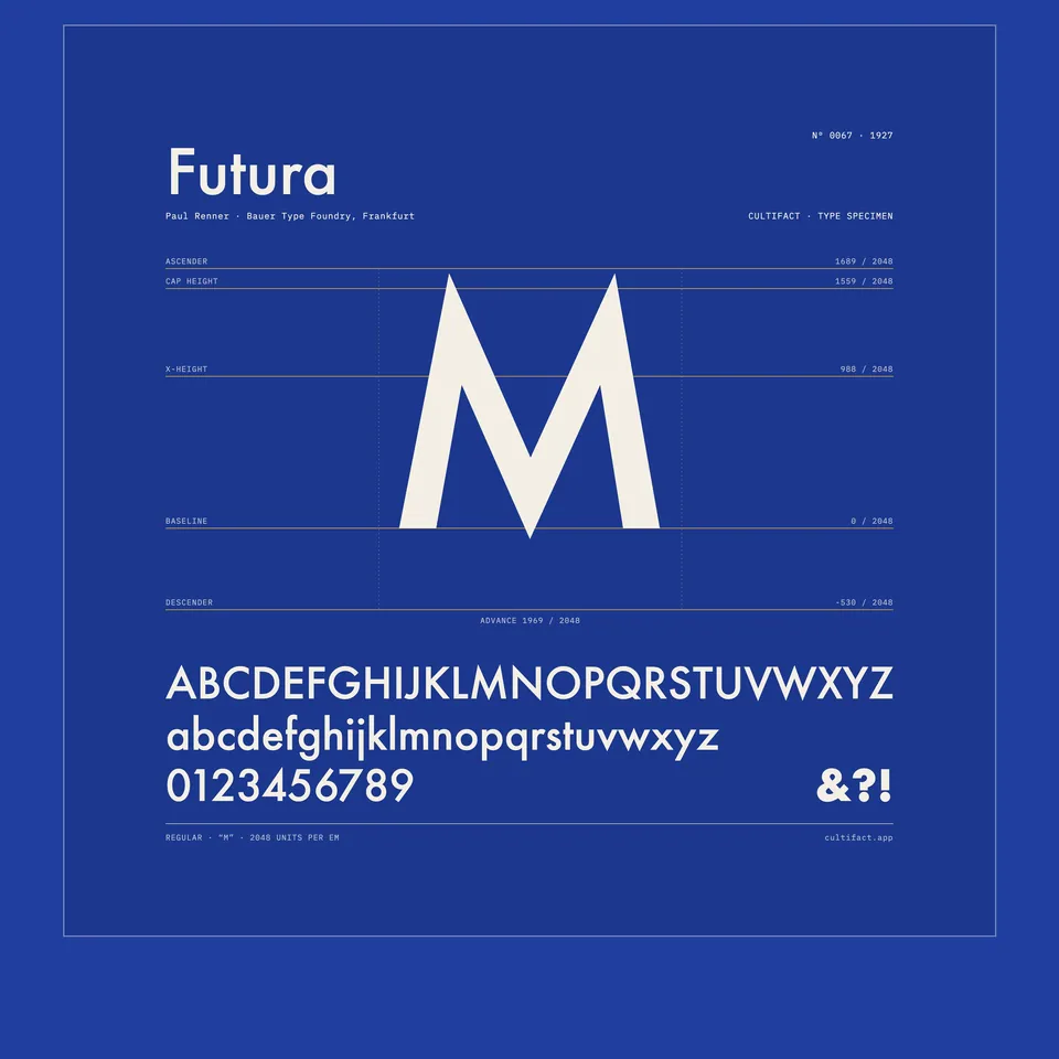 FuturaRenner · 1927 · a geometric sans serif, a decade later
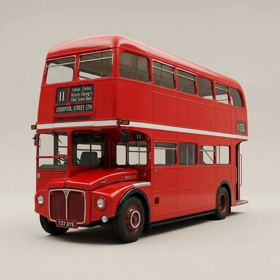 AEC RoutemasterLondon Transport · 1954 · the same network, on the road
In collections
Go further
- Johnston’s Underground Type, Justin Howes (2000)The standard study of the alphabet, its drawings and its production, published by Capital Transport.
- Writing & Illuminating & Lettering, Edward Johnston (1906)Johnston’s own handbook, scanned in full, with his early remark that block letters could be made beautiful.
- Edward Johnston: the man behind London’s lettering, London Transport MuseumThe museum’s account of Johnston’s life and the commission, illustrated with notices, wood type and his bullseye drawing.
- Poster: sheet showing examples of the Johnston Sans Serif Type, CIRC.427-1971, Victoria and Albert MuseumThe museum record for a letterpress specimen sheet of 1916, measuring 101.4 by 63.4 cm.
- The London Underground typeface at 100, Eliza Williams, Creative Review (2016)A centenary piece on the Ditchling exhibition, with a type designer’s view of the alphabet’s calligraphic quirks.
Sources
- Poster (sheet of Johnston Sans Serif type), CIRC.427-1971, Victoria and Albert Museum
- The London Underground typeface at 100, Creative Review
- Johnston, Fonts In Use
- Wikipedia (English), Wikimedia Foundation
- Johnston (typeface), Wikipedia